Perceptual Map Template
 By Jan Suski. I go deep on every review, checking every number against its source and digging up details other coverage misses, a habit from six years of SEO and link building for tech companies. Bylines at Surfer, Brand24, and Senuto. How the scoring works.
Get the perceptual map template
An Excel workbook that turns 1-to-7 survey ratings into average scores, plots any two attributes against each other, and measures how far each brand sits from the ideal product buyers describe.
Download XLSXA perceptual map is a chart that plots how customers perceive a set of brands on two attributes at once, one on each of the x and y axes. Brands that buyers see as alike land close together, and empty space marks a position no rival holds. Harvard Business School's Jill Avery describes it as a way to "provide a visual representation of the competitive landscape," quoted in HBS Online's 2025 guide.
This page covers the free perceptual map template, the theory behind how perceptual mapping works, the six steps to create a perceptual map from survey data, and a worked example in which a coffee roaster maps itself against six rivals and an ideal coffee. It also covers the common mistakes, the limitations of a two dimensional map, and how to build one in Excel, Google Sheets or Word.
The target audience is product marketers, brand managers and founders who need to explain where a product sits in the market landscape and where it could move. Brand positioning starts with consumer perceptions, and a positioning statement written without them is a guess. A perceptual map puts those perceptions on one page, and a picture is worth a thousand words when the room is arguing about who the real rivals are.
The map earns its place because positioning moves sales. Kantar's May 2024 analysis of 6.5 billion consumer datapoints found that brands "meaningfully different to more people command 5X market penetration." A perceptual map shows which difference buyers notice, measured on the scale they use, so strategic decisions about price and product rest on data and the team makes informed decisions from buyer evidence.
Download the free perceptual map template
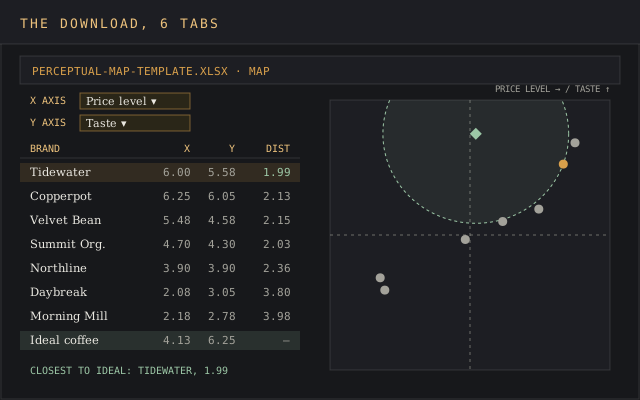
Download the perceptual map template (XLSX)Six tabs: setup with attribute anchors, raw survey responses, average scores, an interactive map with distance to ideal, and a gaps-and-actions log, pre-filled with the coffee example on this page.
The file opens in Excel, Google Sheets and LibreOffice Calc with no account or email needed. Every formula is AVERAGEIFS, COUNTIFS, INDEX, MATCH, SQRT or RANK, so a Sheets copy computes the same averages and distances. Delete the italic example rows on the Survey tab and the blank perceptual map template is ready for your own data. It's a free template you can edit end to end, with every cell unlocked.
What is a perceptual map?
A perceptual map is a graphical representation of what buyers think, which often differs from what the product spec sheet says. Each axis carries one attribute, scored from low to high, and each brand lands at the average rating buyers gave it. In Avery's words, "the distances between brands are then used to create a graphical representation of consumer perceptions."
Most marketers use "perceptual map" and "positioning map" for the same chart. Where they differ, a positioning map, also called a brand positioning map, places brands by the team's own judgement or by objective data such as list price. A perceptual map uses the ratings buyers give. The template builds the perceptual kind, because a positioning map drawn from the team's beliefs tends to show the brand where the team hopes it is.
Product teams also talk about product positioning maps. Product positioning maps place individual products in place of whole brands, which matters when one company sells a budget line and a premium line.
The method is identical: product positioning is read from the same two axes, and product positioning maps built from customer perceptions beat ones built from the spec sheet for the same reason a perceptual map does. Use product positioning maps when the decision is about one SKU in a range, and a brand-level positioning map when it's about the whole company.
Three parts make up every map:
- The x and y axes, each axis representing one attribute with a labelled low end and high end, for instance budget to premium on price level.
- One point per brand, placed at the average of how customers perceive it on both attributes.
- An optional ideal point, the score buyers give the product they would choose if it existed. Distance from each brand to it measures fit.
HBS's own perceptual map example shows why the buyer's view matters, and why consumer perceptions beat a team's guesses about the competitive landscape. When White Claw mapped its market, the chart showed its closest competitor "wasn't another hard seltzer startup, but Corona," a beer. Direct and indirect competitors sit on the same perceptual map once buyers draw it, and the team found out who it was fighting for each purchase.
Avery's read on the result: "It probably wouldn't make sense for White Claw to lower its price," since buyers already paid it as the market leader. The map gave valuable insights into which rival to watch, and the pricing call followed.
Where perceptual mapping comes from
The concept dates from the 1960s, though the history pages most guides skip carry the useful part. The maths came first. Roger Shepard published "The analysis of proximities" in Psychometrika in 1962, and Joseph Kruskal followed with nonmetric multidimensional scaling in 1964, turning judgements of how similar two things are into distances on a chart.
Marketing borrowed it within a decade. Paul Green and Frank Carmone's 1970 book, Multidimensional Scaling and Related Techniques in Marketing Analysis, put the method into marketing research. Al Ries and Jack Trout named the strategy behind it in their "Positioning Era" series for Advertising Age in 1972, according to the Ries firm's own history, and expanded it into the 1981 book Positioning.
The statistics have widened since then. A 2010 ERIM paper by Gower, Groenen, Van de Velden and Vines lists "principal component analysis, (multiple) correspondence analysis, and multidimensional scaling" as the standard ways to build one.
For two attributes with direct ratings, plain averages do the job, and that's what the template uses. Factor analysis and correspondence analysis earn their keep when you have 15 attributes and need to compress them into multi dimensional perceptual maps.
Types of perceptual maps
Two dimensional maps and multi dimensional maps are the split that matters for choosing a method. Boardmix's perceptual map examples page sorts maps into five types "based on how the data is presented," and the table below adds when each one fits.
| Type | What it shows | Best for |
|---|---|---|
| Two dimensional perceptual map | Brands on two key attributes, one per axis | Simple competitive comparisons and slides |
| Multi dimensional perceptual maps | Several attributes compressed into two derived axes by MDS or factor analysis | Complex markets with ten or more attributes |
| Spidergram | One spoke per attribute, one outline per brand | Comparing four to eight attributes for three or four brands |
| Joint map | Brands plus clusters of buyer preferences on the same axes | Market segmentation and spotting which group wants what |
| Intuitive map | Brands placed by the team's judgement, no survey | A first sketch before you collect data |
The template builds a two dimensional perceptual map you can redraw on any pair of attributes, plus an ideal point, which gets you most of a joint map's value without cluster analysis. Switching the axes on the Map tab turns one survey into several maps, and that's where the second half of the worked example below comes from.
What a perceptual map is used for
The chart is a strategic tool for five recurring decisions, each of which shows up as a specific pattern on the map:
- Finding market gaps. Empty space near the ideal point is an unmet need with no brand serving it. Perceptual maps identify gaps this way, and identifying market gaps is how new product development picks a target position.
- Competitive analysis. Brands sitting close together compete for the same purchase. The perceptual map shows which major competitors crowd your corner, which only look similar on paper, and where you identify strengths a rival can't copy quickly. That's the competitive advantage to build messaging on.
- Segmentation. Market segmentation divides consumers into distinct groups, and when you map each group's ideal point separately, the clusters show which segment each brand serves. The customer segmentation template builds those groups first.
- Messaging. If customers perceive your brand as pricier than it is, or consumers perceive it as less ethical than its sourcing deserves, the fix sits in marketing strategies and pricing communication, and the product can stay as it is. Those are two marketing strategies you'd never pick without a map. A messaging framework turns that finding into copy.
- Tracking. Re-running the same survey every six or twelve months shows if marketing efforts moved perception, measured in points on the same scale. It's the cheapest way to keep an eye on consumer behavior between big studies.
Every one of those decisions relies on the perceptual map reflecting how consumers perceive the category. A map based on internal opinion gives marketing teams a picture of their own assumptions, and plenty of teams have spent a quarter barking up the wrong tree because of one. Done with real buyers, the chart is a valuable tool for market positioning and competitive positioning alike, and the valuable insights tend to come from the brands sitting where nobody expected.
The six tabs of the perceptual map template
Each tab of the perceptual map workbook does one job, and formulas carry data from left to right, so nothing gets retyped:
| Tab | What you enter | What it calculates |
|---|---|---|
| How to use | Nothing | Order of work, scale rules, colour key |
| Setup | The decision, the buyer segment, sample size, and four to six attributes with a plain-language anchor at 1 and at 7 | Nothing; it fixes the questions before data arrives |
| Survey | One row per respondent per brand: six columns of raw data | Ratings are validated to whole numbers from 1 to 7 |
| Scores | Brand names in column A | Response count and average per attribute, shaded red to green |
| Map | The X and Y attribute, picked from two dropdowns | Coordinates, distance to ideal, rank, closest brand, and the scatter chart |
| Gaps & actions | What the map shows, the evidence cell, the decision, the owner and a re-survey date | Nothing; it's the record the next survey gets checked against |
The distance column does the work most free templates skip. It's the straight-line gap between a brand and the ideal point, calculated as SQRT((x−xideal)^2 + (y−yideal)^2), so the reading of "who is closest to what buyers want" stops being a matter of squinting at dots. Teams that want a better understanding of a rival than the dots give can pair the map with the SWOT analysis template.
How to create a perceptual map in six steps
1. Define the objective and scope
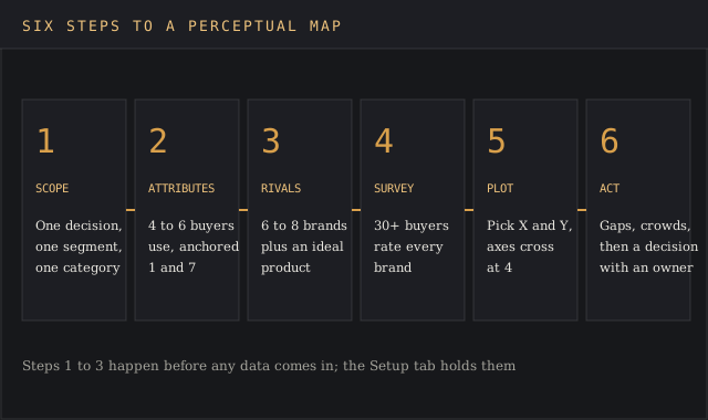
Write the decision the map has to inform on the Setup tab before anything else. A usable scope reads like "where should a new mid-priced blend sit?", a question one survey can answer. Name the product category and the target market, because a perceptual map of all coffee buyers and a perceptual map of whole-bean buyers in grocery stores come out differently. Skip this and the project turns into a wild goose chase through every attribute anyone suggests.
2. Identify key attributes
Pick four to six key attributes buyers use when making purchasing decisions, and take them from customer interviews, review text, consumer feedback and sales notes. Choose attributes the way buyers would, then pick two attributes for the first map. Favour ones that vary between brands; if every brand scores 6 on safety, safety won't separate anything. Write a plain anchor for each end of the 1 to 7 scale so every respondent reads 1 and 7 the same way.
3. Choose competitors
List direct and indirect competitors, including indirect competitors from other categories, the way Corona turned up on White Claw's map. Asana's guide says to "aim for at least 10 competitors to get an accurate visualization of your market position." For a desk-research map that's sound. For a survey, every brand adds a full block of ratings per respondent, so six to eight brands plus the ideal keeps the questionnaire short enough to finish.
4. Collect data
Collect data with consumer surveys that use the same anchors for every brand, and add the ideal product as one more object to rate. Focus groups and interviews tell you which attributes to ask about, and consumer surveys give you the raw data and the numbers.
Run focus groups first, because a survey can only measure the attributes you thought to ask about. Market research panels make this quick, and a short survey of 40 completes is a small market research project, measured in days. The coffee example uses 40 respondents, and the Scores tab flags any average resting on fewer than 30 ratings as directional.
5. Plot the map
Paste responses into the Survey tab, pick the X and Y attributes on the Map tab, and the perceptual map redraws. The axes cross at 4, the midpoint of the scale, so each quadrant means something: above-average on both, below-average on both, or one of each.
6. Read the gaps, then act
Look for three patterns, which is how you identify gaps worth acting on: empty space near the ideal point, crowded corners where several brands compete for the same buyers, and gaps between where you think you sit and where buyers put you.
Write each finding on the Gaps & actions tab with the cell that proves it, so the map can reveal opportunities and lead to informed decisions about price, product and placement. A finding with no decision attached is a picture, and a picture doesn't change the plan. The white space analysis template takes a promising gap and sizes it.
Worked example: a coffee roaster maps seven brands
Tidewater Roasters is a regional specialty roaster selling whole-bean coffee in grocery stores, and this perceptual map example follows its survey from setup to decisions. Its question: where should a new mid-priced blend sit? It surveyed 40 regular whole-bean buyers, each rating Tidewater, six rival brands and an ideal coffee on four attributes. Brand names and ratings are illustrative, and they're the same values that ship in the download.
| Brand (n = 40 each) | Price level | Taste | Convenience | Ethical sourcing |
|---|---|---|---|---|
| Tidewater Roasters | 6.00 | 5.58 | 2.88 | 5.35 |
| Copperpot | 6.25 | 6.05 | 2.30 | 5.93 |
| Velvet Bean | 5.48 | 4.58 | 5.15 | 4.00 |
| Summit Organics | 4.70 | 4.30 | 3.45 | 5.95 |
| Northline | 3.90 | 3.90 | 6.20 | 2.98 |
| Daybreak | 2.08 | 3.05 | 6.30 | 2.70 |
| Morning Mill | 2.18 | 2.78 | 5.75 | 2.15 |
| Ideal coffee | 4.13 | 6.25 | 5.25 | 4.93 |
On the first map, price level runs along the x axis and taste up the y axis. Buyers want a coffee that tastes like a 6.25 and costs like a 4.13, a little above the middle of the shelf. No brand is there. The closest, Tidewater, sits 1.99 points away, and every other brand is at least 2.03 away.

The distance column on the Map tab ranks them:
- Tidewater Roasters, 1.99
- Summit Organics, 2.03
- Copperpot, 2.13
- Velvet Bean, 2.15
- Northline, 2.36
- Daybreak, 3.80
- Morning Mill, 3.98
Three conclusions follow from this perceptual map example. The open space is high taste at a middle price, which hits the nail on the head for the new blend's brief. Tidewater and Copperpot crowd the premium corner, 0.25 points apart on price, so premium cues in ads fight Copperpot for the same buyer. The budget brands sit far from what buyers want and don't threaten the new blend.
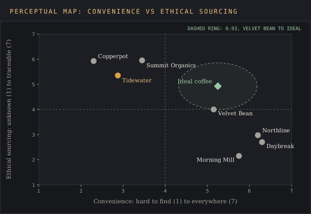
Switch the Map tab to convenience against ethical sourcing and the story flips. Velvet Bean sits 0.93 from the ideal, and Tidewater drops to fourth at 2.41, because buyers rate it 2.88 on convenience: customers perceive the coffee well but can't find it. That's a distribution problem, and no amount of messaging fixes an empty shelf. One survey, two maps, two different strategic decisions: that's why the template keeps the axes on dropdowns.
The Gaps & actions tab records four decisions: launch the mid-priced blend and test its shelf price below Velvet Bean's, drop premium cues from ads in favour of freshness and roast date, add two grocery chains in the home region, and re-survey in March 2027. Each row points at the cell that proves it, so the March survey can show which of the four moved customer perceptions and which missed the mark.
Perceptual map examples from other industries
The attribute pair changes by category, and picking it is most of the skill. These are the pairs that show up in perceptual map example after perceptual map example, with what each one tends to reveal about how customers view different brands:
| Market | Common axes | What the map usually shows |
|---|---|---|
| Automobile industry | Price vs fuel efficiency, or price vs safety | Car brands based in one country often cluster; luxury brands charge a premium price for premium features |
| Fast food chains | Taste vs value, or healthiness vs convenience | A crowded cheap-and-quick corner and a thin healthy-and-quick one |
| Smartphone market | Price vs features, or price vs brand prestige | Two or three brands owning the premium end and a long tail of feature-for-price challengers |
| Cosmetics | Price sensitivity vs perceived quality | Segments split by how much quality buyers believe price buys |
| B2B software | Ease of use vs depth of features | Suites high on depth, point tools high on ease, and a gap for both; product positioning maps here often plot each plan tier separately |
A perceptual map of different car brands based on price and fuel efficiency is the classic textbook example from the automobile industry. The coffee case above shows the trap in copying one: the right axes are the ones your buyers use, and a textbook's pair was picked for a different product category.
For software categories, our market positioning tools ranking covers platforms that track how buyers describe each vendor, and product positioning maps for software usually start from that review data. A market based on reviews moves fast, so expect to redraw the competitive landscape twice a year.
Common mistakes and limitations
Most bad maps fail on input, and the chart itself is rarely the problem. The six mistakes below account for the maps that end up back at the drawing board:
- Mapping internal opinion. A team rating its own brand is a positioning sketch, and the devil's in the details it gets wrong. Survey the target audience to learn what sits in consumers minds, and read consumer behavior from what they buy as well as what they say.
- Correlated axes. Price and quality move together in many categories, so the brands fall on a diagonal line and the map shows one dimension twice.
- Attributes buyers don't use. If interviews never mention it, it won't drive choice, however proud the product team is of it.
- Too few respondents. Ten ratings per brand produce averages that move half a point when one person changes their mind.
- No ideal point. Empty space is only an opportunity if buyers want something there. Some corners are empty because nobody wants a cheap, terrible coffee.
- A map treated as set in stone. Perceptions drift with market dynamics and industry trends. Update the perceptual map every six to twelve months.
Two limits come with the method itself. Consumer perceptions are subjective and averages hide segments: a 4.0 can mean everyone says 4, or half say 1 and half say 7. Read the raw data before trusting a midpoint.
And two axes can't show a market that buyers judge on six attributes at once. Running several maps from one survey, as the worked example does, covers most of that gap without the statistics a full MDS study needs, and gives a more complete picture of the competitive landscape than any single pair of axes.
Excel, Google Sheets, Word or a whiteboard tool
The right tool to create a perceptual map depends on where the data lives. A survey-based perceptual map needs a spreadsheet, because averages, counts and distances have to calculate. A sketch for a workshop can live on a whiteboard.
- Excel. Build a scatter chart with one series per brand so each gets its own legend entry, set both axes to 1 to 7, and cross them at 4. The template does all three.
- Google Sheets. Upload the XLSX and the formulas run unchanged. The chart may need its axis bounds re-set after import.
- Word. Insert a scatter chart from the Insert menu, which opens an embedded Excel sheet, or draw a cross with shapes and place brand labels by hand for a quick intuitive map.
- Canva, Miro or Figma. Good for a team brainstorm, but you'll be placing dots by eye, so treat the result as a hypothesis to test with a survey.
Whatever you use, keep the raw ratings, since consumer perceptions shift and you'll want to compare. Product positioning maps drawn by hand in a design tool can't be re-run. Data you can re-plot next quarter beats a polished slide you can't update.
FAQ
How can I create my own perceptual map?
Pick two attributes your target audience cares about, survey those customers on a 1 to 7 scale for each brand, average the ratings, and plot the averages on a scatter chart with the axes crossing at the midpoint. Add an ideal product to the survey so you can see where buyers want a brand to sit.
Are a perceptual map and a positioning map the same?
Mostly, yes, and many teams use the names interchangeably. Where a distinction is drawn, a perceptual map uses customer perceptions and a positioning map places brands from the company's own view or objective data such as list price. A positioning map is quicker to draw, and a perceptual map holds up better when someone asks where the dots came from.
What is a perceptual map used for in marketing?
Marketing teams use a perceptual map to find market gaps, see which rivals compete for the same buyers, test if brand perception matches the intended positioning, and plan targeted marketing campaigns for segments the map shows are underserved. Our guide to brand research covers the surveys that feed it.
How do I create a perceptual map in Excel?
Put brand names in one column and the two average scores in the next two, insert a scatter chart, add one series per brand, set both axes from 1 to 7 and cross them at 4. The template on this page has that chart wired to a dropdown so you can swap attributes.
How many competitors should a perceptual map include?
Asana suggests at least 10 for a desk-research map. For a survey-based map, six to eight brands plus an ideal product keeps the questionnaire short enough that respondents finish it.
What are the disadvantages of perceptual mapping?
Perceptions are subjective, averages can hide split opinions, two axes can't capture every attribute buyers weigh, and the map goes stale as the market moves. Surveying real buyers and re-running the map on a schedule handles most of these.
What is a branding map?
Branding map is another name for a brand positioning map or perceptual map: a chart that places your brand against rivals on attributes such as price, quality or personality, used to plan how the brand should be perceived.
Bottom line
Reach for this perceptual map template when a positioning, pricing or launch decision depends on how buyers see you against rivals, and you can survey at least 30 of them. The distance-to-ideal column turns the perceptual map from a picture into a ranking you can act on, and the Gaps & actions tab keeps a record of informed decisions the next survey can check.
It's the wrong file when the question is what the brand should say: that's the positioning statement template, which takes the map's open space as its input. For a feature-by-feature view of rivals, the competitive analysis template fits better, and for deciding which buyers to target in the first place, start with the ideal customer profile template.